
When creating or updating web pages, users often select a heading based on what looks best on the page, essentially choosing form over function. But following the correct heading hierarchy is crucial to user experience and web accessibility following WCAG guidelines.
Visually, headings are usually designed to stand out from surrounding text through the use of larger and bolder fonts. This allows sighted users to scan your content at a glance to see if it’s relevant to them.
But taking the time to thoughtfully organize your content into a logical outline and using the correct semantic markup also benefits users who have disabilities such as blindness or low vision and often use assistive technologies to navigate the web. Screen reader users can navigate a page by headings, listen to a list of all headings, and skip to the desired content to begin reading at that point.
Screen readers read headings according to their semantic markup—following the heading style numbers. The numbering system organizes content chunks for the user. So it can be really confusing if headings are chosen arbitrarily based on their colors or styles.
Use web page headings to improve accessibility
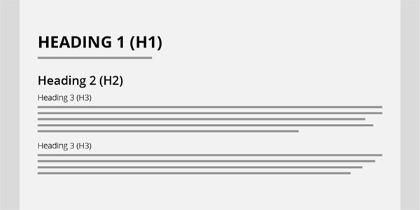
To use headings correctly, keep in mind that every page needs to have an H1, usually the page title. If the page contains several sections of content, then each section should start with an H2 and be organized by rank. For instance, an H4 should never follow an H2. Headings with an equal or higher rank start new sections of content and headings with a lower rank start new subsections that are part of the higher ranked section. It’s ok to follow a lower ranked heading, such as an H4 with H2, because the H4 would be closing out a higher ranked section and the H2 starts a new section.
Fixed page sections such as the footer or sidebar headings are usually separate content from the main section, so those sections should always start with an H2.
Help your website editors maintain web accessibility
Using headings correctly is one of the basic principles of web accessibility and many content management system users aren’t aware of the importance of correct heading hierarchy. Or, worse, a previously compliant website isn’t maintained dynamically. In our ongoing WCAG auditing for clients, incorrect application of styles is by far the most common error we see introduced by website editors.
If you’d like some help organizing content for accessibility, auditing a compliant website, or training employees, talk to us!