In the 1800s, the first truly vibrant green pigment was worth dying for. At least, that's what Victorian England thought.
Swedish scientist Carl Scheele created Scheele's green, an unusually bright, new hue of pigment. Variants of Scheele's green, Emerald green and Paris green, soon followed—all deriving their base from copper arsenite, reports The Telegraph. These green pigments were so popular, they quickly became used to color clothing, wallpaper, ink, fake flowers, stamps, and even confectionery, reports National Geographic.
But they were also extremely toxic. Made from the poison arsenic, Scheele's green slowly poisoned everyone who came in contact with it. The dye caused a rash when in direct contact with skin, which it often was: it was used in gloves, dresses, and even socks, according to Racked.com.
Dying for color
Britain knew the consequences of this color, but continued to use it anyway. In 1862, the British Medical Journal wrote, “A lady in full dress carries on her head enough [arsenic] to poison herself and nineteen friends.”
Apparently, possessing such vibrant color was worth the horrific consequences.
2 sides of green
Why are we so attracted to green? From a scientific perspective, we see green best of all the colors, reports CNN. Technically, we are most sensitive to the green light waves that reflect off an object, making it appear green to our eyes. We can distinguish among more shades of green than any other color, reports Digital Synopsis, which is why night vision goggles are green.
But for 8% of the world's population, green is the hardest color to see. 99% of people with color blindness have difficulty distinguishing between red and green, reports Colour Blind Awareness. (Designing for accessibility? Learn more in Web Accessibility 101)
Green is calming
Have you ever wondered where the “green rooms” got their name? After hours looking at bright stage lights, actors would retreat to a room traditionally painted green, believed to calm them down. Green mimics nature's natural calming effect; additionally, green produces the least amount of eye strain, since green light is easiest to perceive, reports CNN.
Green in design
Green has more shades than any other color. Its shades range from soothing—foliage, celadon, hunter—to shocking—chartreuse, lime, jade.
Green's most obvious connotation is of nature. Because it's the most prominent shade found in the natural world, greens can be used in design “much the same as a neutral color,” according to Leatrice Eiseman of The Pantone Color Institute.
Evoking freshness, healing, and energy, foliage greens are simple, effective choices for companies showcasing natural products or lifestyles. Grocery stores, restaurants, spas, and outdoor companies can all “go green” with good results.
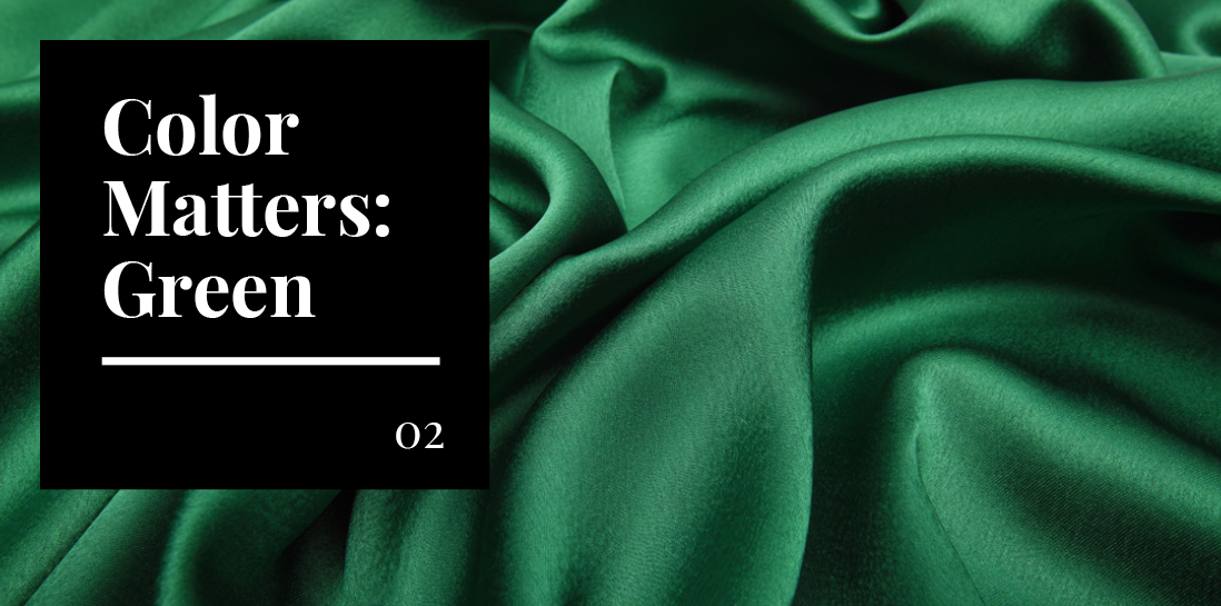
Emerald greens are elegant and mysterious (think the Emerald City in The Wizard of Oz), while mint is playful and refreshing (think retro 1950s appliances).
Dark greens, which echo the color of money, are associated with prestige. These shades are excellent choices for banks, businesses, and vehicles—anything where “security is a factor,” says Eiseman. Iconic brands like Starbucks and Land Rover trade on the renewing and prestigious qualities of dark green, respectively.
Proving its versatility, green remains a popular and effective design choice—no poison required.