French composer Claude Debussy once wrote to a friend, “The colour of my soul is iron-grey and sad bats wheel about the steeple of my dreams.” Debussy’s haunting compositions are underscored with melancholy and longing, feelings long associated with the color gray.
Though often described today as an Impressionist composer, Debussy himself scoffed at the term as something used by imbeciles. He thought the term “as poorly used as possible, particularly by the critics.”
Rather, he said, “I am trying to do ‘something different’” according to Great Musicians and their Amusing Stories.
Painter James Abbott McNeill Whistler, a contemporary of Debussy, created art in shades of gray that deeply inspired Debussy. Whistler’s Nocturne paintings, done in a striking style evocative of night or twilight, sparked Debussy’s three Nocturnes orchestral movements. Debussy is said to have described his Nocturnes as, “an experiment in the different combinations that can be obtained from one color—what a study in grey would be in painting.”
James Whistler’s famous painting, Arrangement in Grey and Black No. 1, explores enigmatic layers of gray and black. Known colloquially as Whistler’s Mother, the result of his exploration is a striking painting that’s simple without being stark; dim, yet not dark.
Perhaps we could say the same of the color gray; it is dim, yet not dark.
Gray in art
A monochromatic style of painting known as grisaille uses exclusively shades of gray to achieve a look that mimics sculpture. Because of its aesthetic simplicity, it often stands alone; though oil paintings can also grisaille as an under layer.
Black and white film—whether used in photography or cinema—explores the spectrum of shades that exist between black and white. Though it’s known as “black and white” photography, much of what our eyes actually see is gray. It’s these very gray shadows that bring a suggestive, mysterious quality to black and white photos. It’s the gray areas in which the magic happens.
Gray in popular culture
If everything isn't black and white, I say, 'Why the hell not?'John Wayne
Since at least the early 1900s, Americans have been using the color gray to represent an area of ambiguity. A “gray area” is neither morally black nor white; neither clearly wrong nor clearly right. In this instance, we attach an abstract concept of morality to a concrete color.
Another popular idiom associates the color gray with thinking and intellect. Hercule Poiret, the fictional detective created by Agatha Christie in the 1920s, is famous both for his impressive moustaches and his world-renowned “little grey cells.” Brains were first described as “gray matter” in the late 1800s, according to The American Heritage Dictionary of Idioms. With a precision the Belgian detective would appreciate, scientists have now revealed that the gray matter in a living brain is actually more of a pinkish gray, due to blood flow.
With the advent of technology, gray has taken on still another connotation. Instead of being something of nebulous morality or staid intellect, gray has become a symbol of the future; sleek; minimalist. Owing its rebrand in part to Macintosh, which normalized technology clothed in various iterations of “space gray,” the modern gray is trendy and technological. Shades of gray now deck entire homes and compose entire wardrobes. After all, “gray is the new black,” as they say.
Gray in fashion
Gray may now be a chic, modern neutral to wear in the 21st century, but it was once associated with the particularly pious, poor, or sober.
Many religious sects and orders wore gray, the color of undyed wool, for both its plainness and its economy. In England and Scotland locals called the order of Francisan friars the “Grey Friars,” for their gray robes and vows of poverty, reports the University of Leicester.
Likely for the same reasons of economy, the Confederate Army dyed their cotton uniforms a drab shade of Confederate Gray during the Civil War, reports HistoryNet. The earthy, serious gray also served as a perfect foil to the Union’s deep blue uniforms.
Gray was also an acceptable color to wear during mourning; no one associated joy with the staid color. And, as more Americans transitioned into factory and office jobs, gray appealed as a serious, workplace wardrobe choice. Office workers began to swath themselves in the same unobtrusive gray as their cubicles.
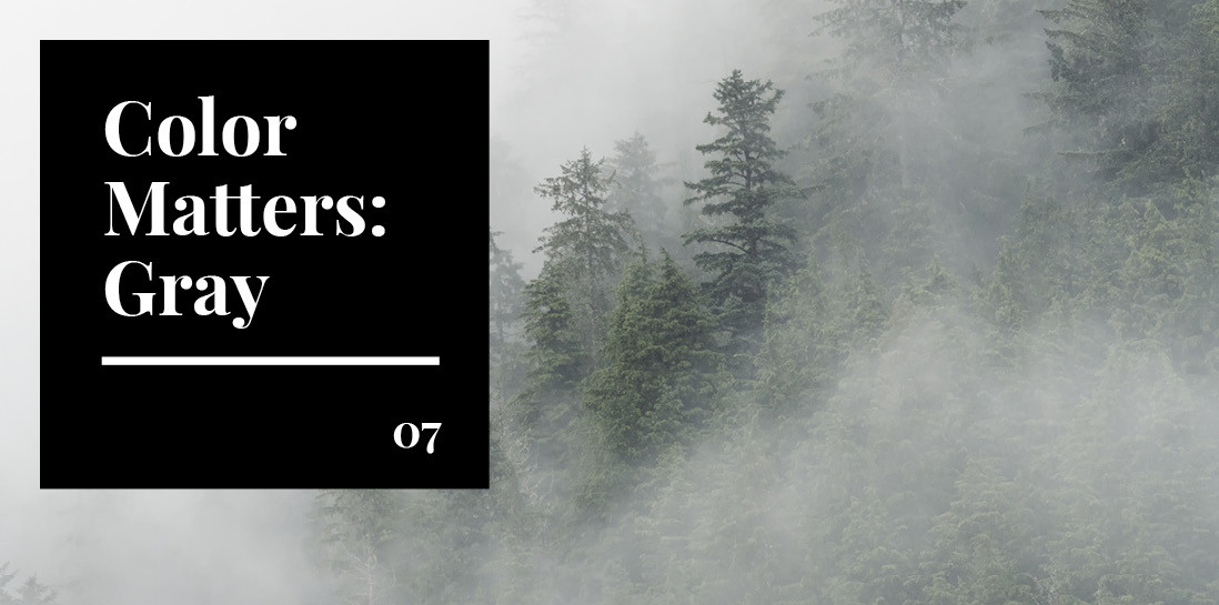
Gray in nature
In nature, the color gray is associated with the drear of winter. It conjures up images of fog, ice, and stormy skies heavy with rain.
No matter the continent or climate, neutral gray offers an ideal camouflage on land or on sea; just ask the gray wolf, the seal, the dolphin, or the elephant. Rocks, water, sand, snow, mud, and underbrush are no match for gray’s concealing qualities.
Additionally, gray stirs associations of aging, death, and decay in the natural world. In illness and death, humans and animals take on an ashen pallor.
Is gray right for your brand?
In the world of color, gray functions as a neutral. It’s more stark than white, softer than black. According to Leatrice Eiseman of the Pantone Institute, gray is “linked to timelessness and dependability.”
Soft dove gray is quiet and calming, while ash and iron gray are cool, distant, detached. Leaden gray is melancholy or oppressive; slate is no-nonsense and masculine. Deeper shades convey luxury and refinement, while lighter shades add warmth to any setting.
Paired with red, gray feels cutting edge and modern; with navy, nautical and preppy. Combining gray with black or white sets a mysterious, artistic mood. Gray softens brighter, feminine colors like yellow or pink with a calming influence. Ambiguous taupe and greige bridge the color gap between browns and blacks.
On its own, gray is restrained, mature, and calm. But it’s a color chameleon; our perception of gray is easily influenced by surrounding colors and light. Cool gray shades have blue undertones, while warm grays have undertones of yellow or brown.
Though technology, finance, or construction industries are logical fits for clean gray branding, try an unexpected use of a softer, warmer gray for health or beauty brands. Explore gray for food and beverage packaging with a masculine sophistication. (Think of premium Grey Goose vodka or the elegance associated with Earl Grey tea—maybe due in part to their British spelling of “grey.”)
In using the color gray to describe his soul, Claude Debussy may have meant to convey the melancholy he felt. Today, we might look at the same “iron-grey” color and rejoice at its sleek modernism, its timelessness. But perhaps that’s fitting for a composer regarded as experimental and moody by his contemporaries and critics. With its ageless appeal, gray may be the “something different” for which Debussy was striving.