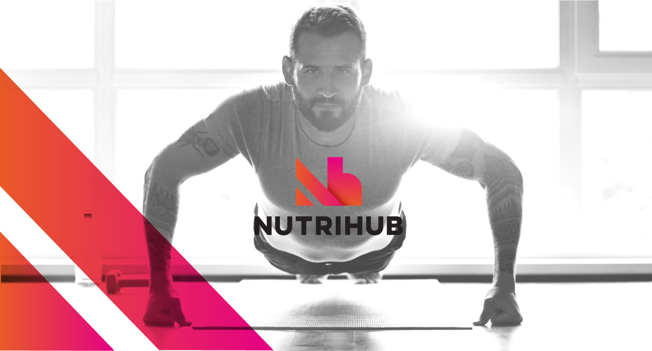
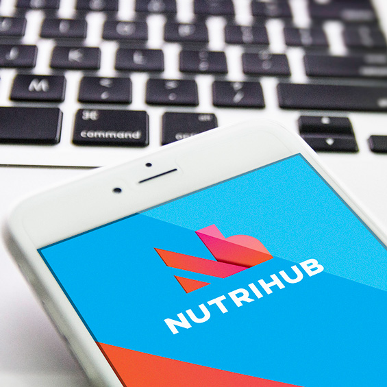
Vibrant colors and dynamic shapes form the building blocks of NutriHub’s logo and brand personality.
Scope
- name, logo, and identity
- signage & interior design
- apparel design
- menu, business card, and cup design
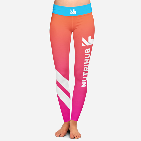
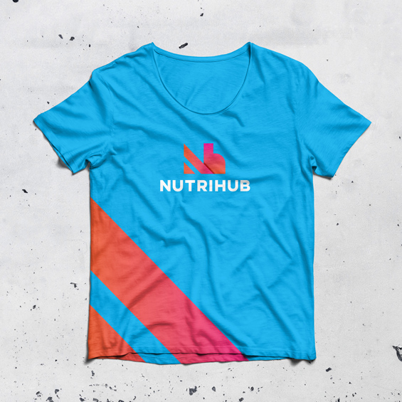
NutriHub’s signature colors and clean design imbue collateral with a powerful, playful energy. The brand translates well to a line of activewear apparel that reinforces the strength that results from eating well.
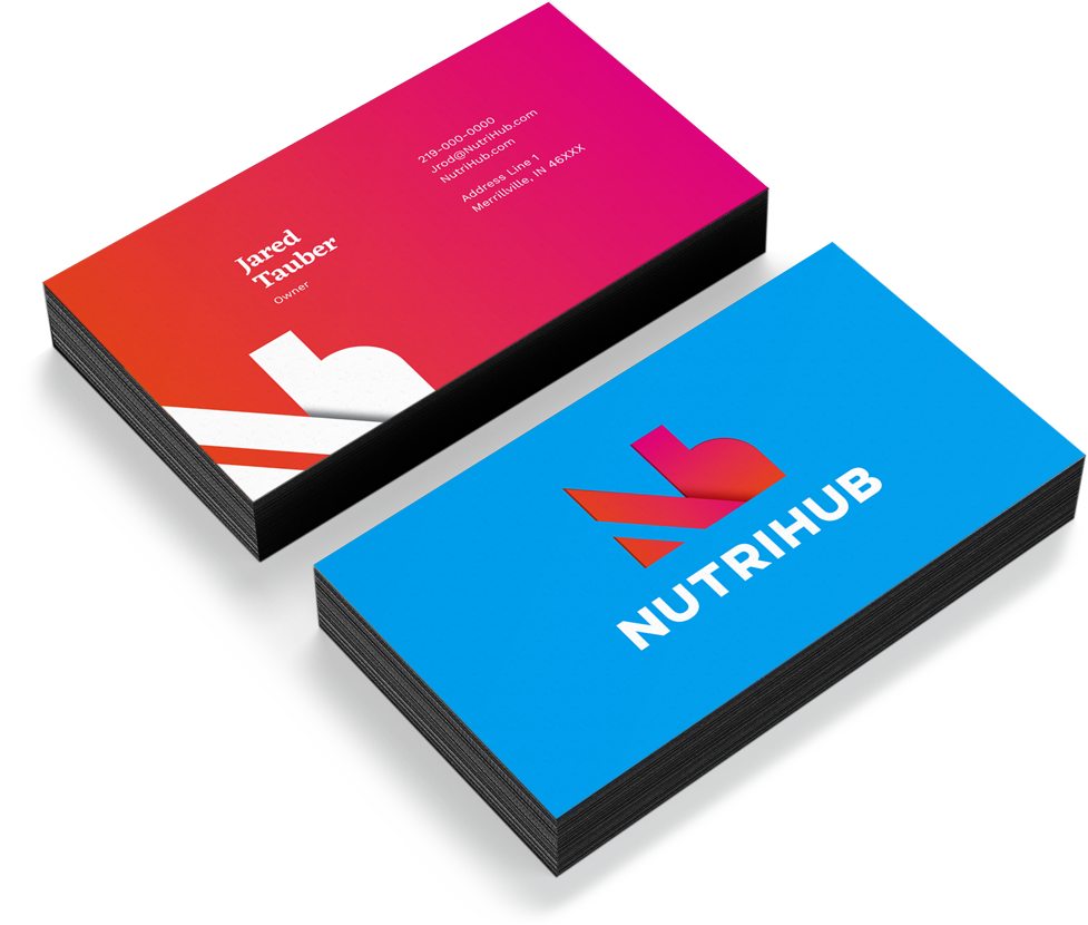
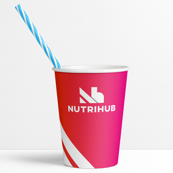
Streamlined business cards play with gradients and texture to make a striking first impression. Continuing the retail experience, custom disposable cups carry the brand from storefront to customers on the go.
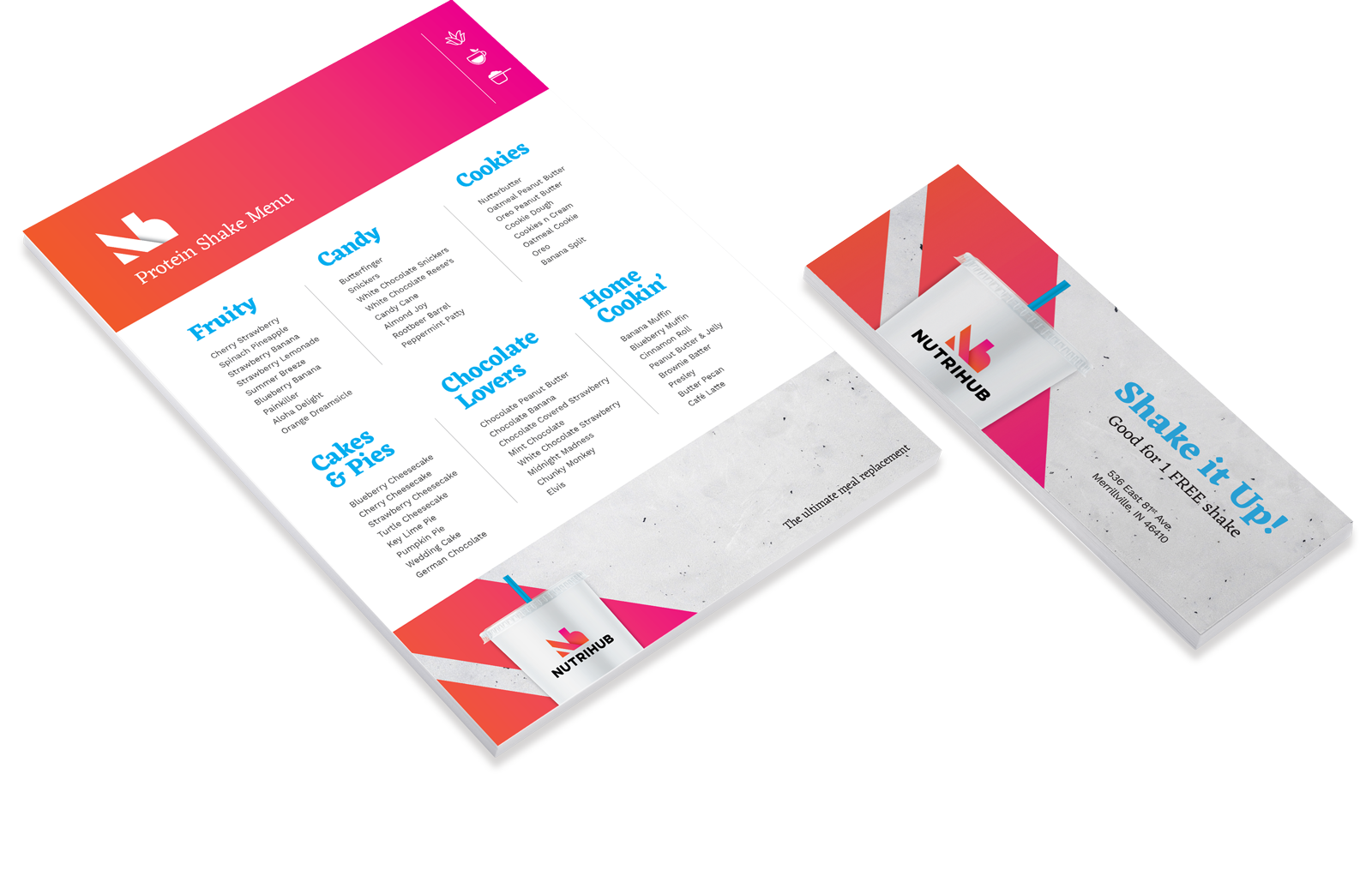
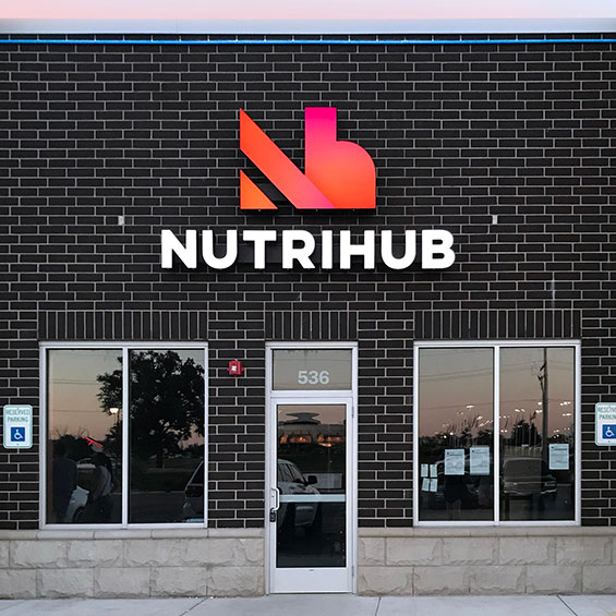
A coupon for first-time customers and a memorable menu help drive business into the storefront location and keep customers coming back. Custom signage on its Merrillville, Indiana retail location allows NutriHub’s big brand presence to be seen and noticed from the road.
