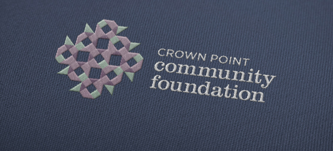
At a discovery session in the Foundation’s conference room, we took notice of the large, ornate quilts decorating the space. Parallels between the art of quilting and the work of the Foundation immediately came to mind. It was an emotional “EUREKA” moment for both the Foundation’s leadership and our creative team.
marketing strategies
- Use authentic brand discovery
- Conduct Brainstorming
- Bring the brand personality to life
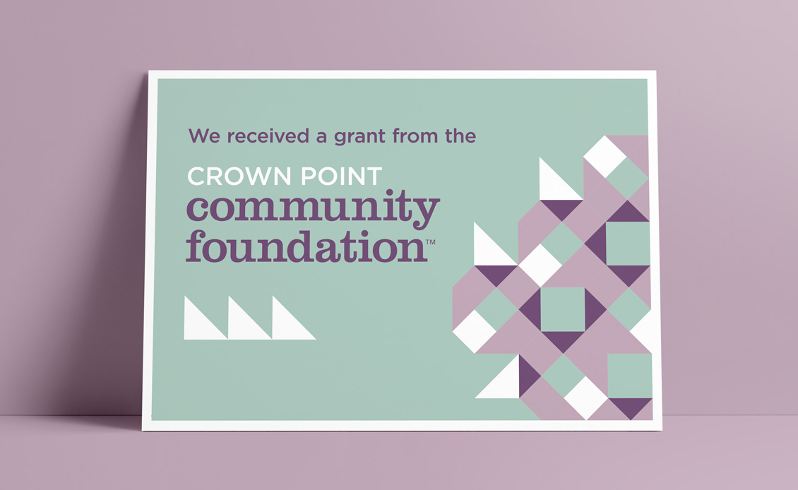
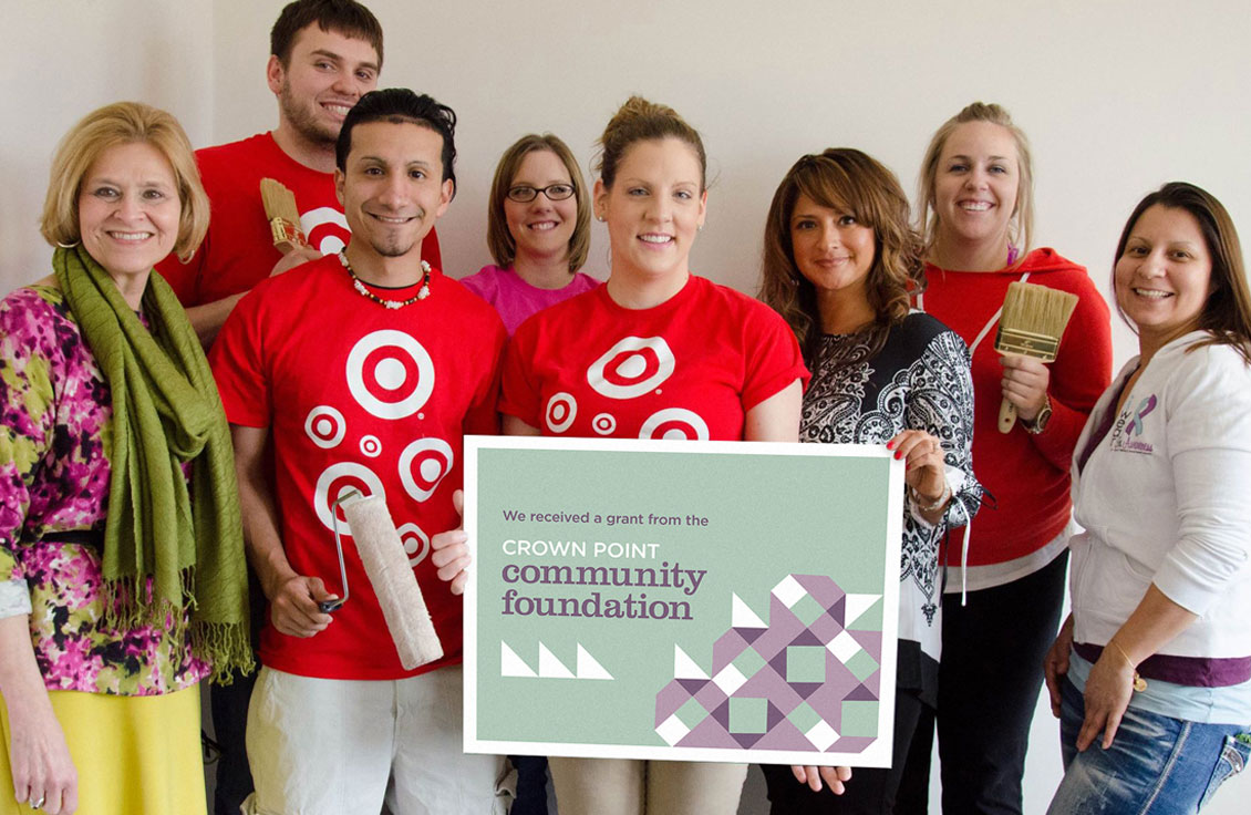
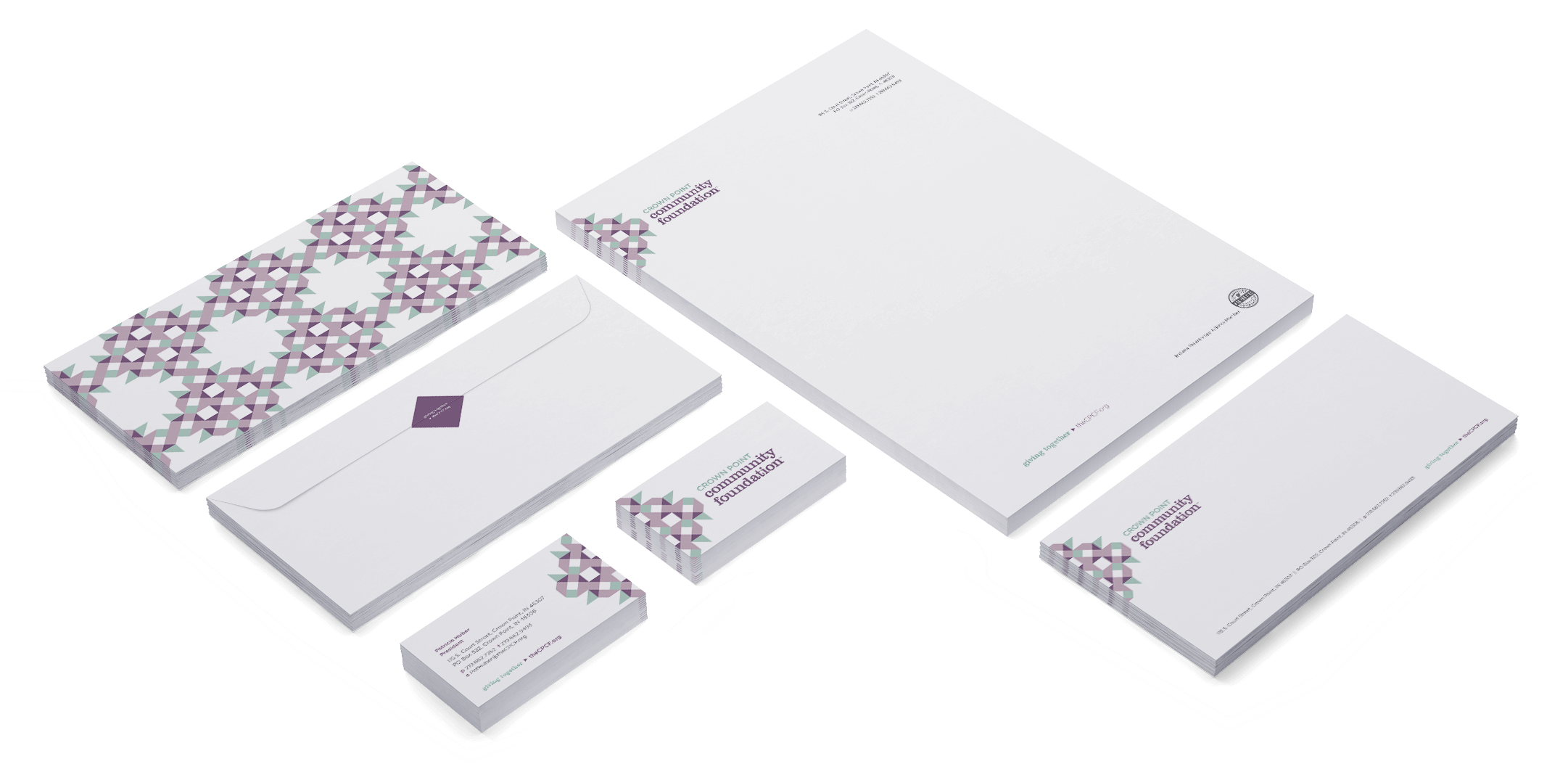
We used techniques and patterns found in quilting to create motifs of the Foundation’s initials. Combined, the initials created what’s known as a quilt block.
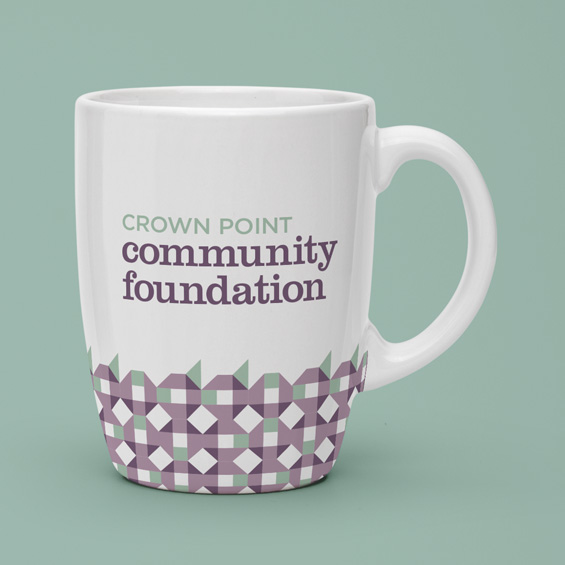
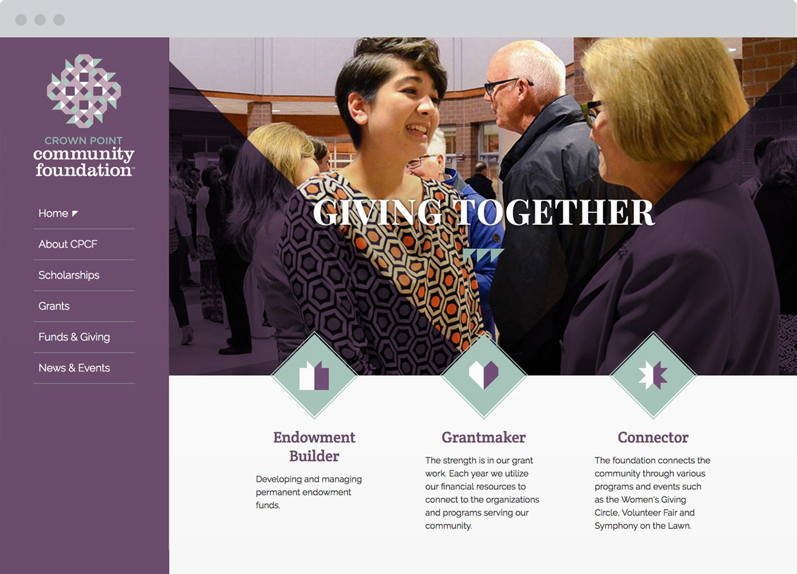
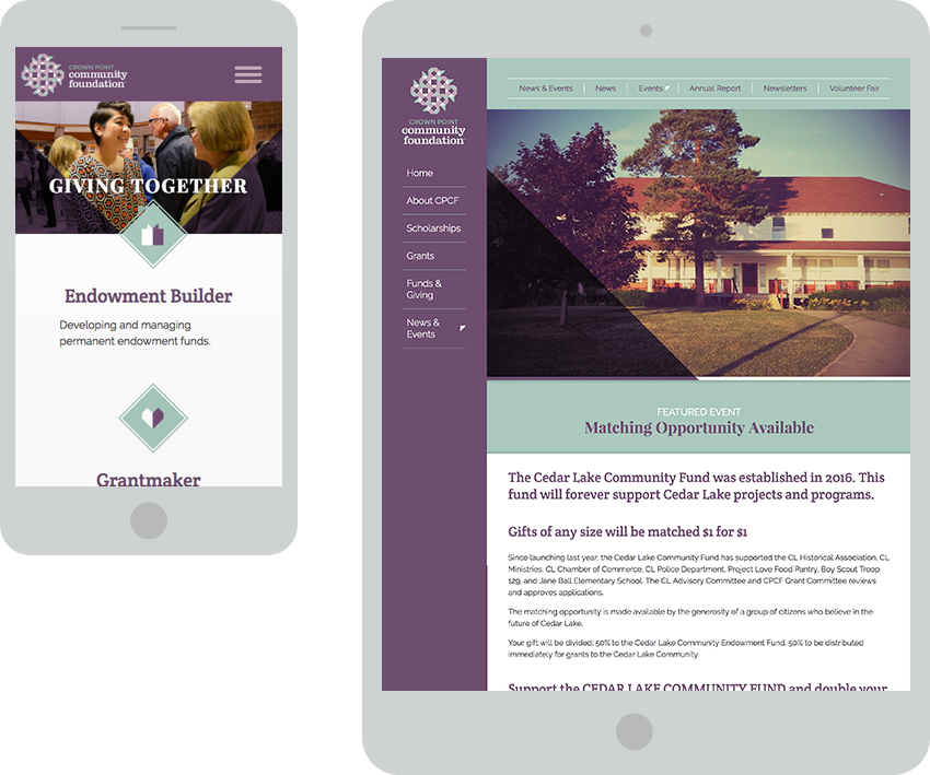
Cool, calming colors like sapphire, iris, quartz, and mint were chosen to represent wisdom, vision, transformation, growth, restoration, and generosity. Our partnership earned the recognition of a 2015 American Graphic Design Award in Logos, Trademarks + Symbols—proof that the whole is greater than the sum of its parts. Interactive design blends with a Content Management System (CMS) to define a user experience that is easy to maintain in-house.